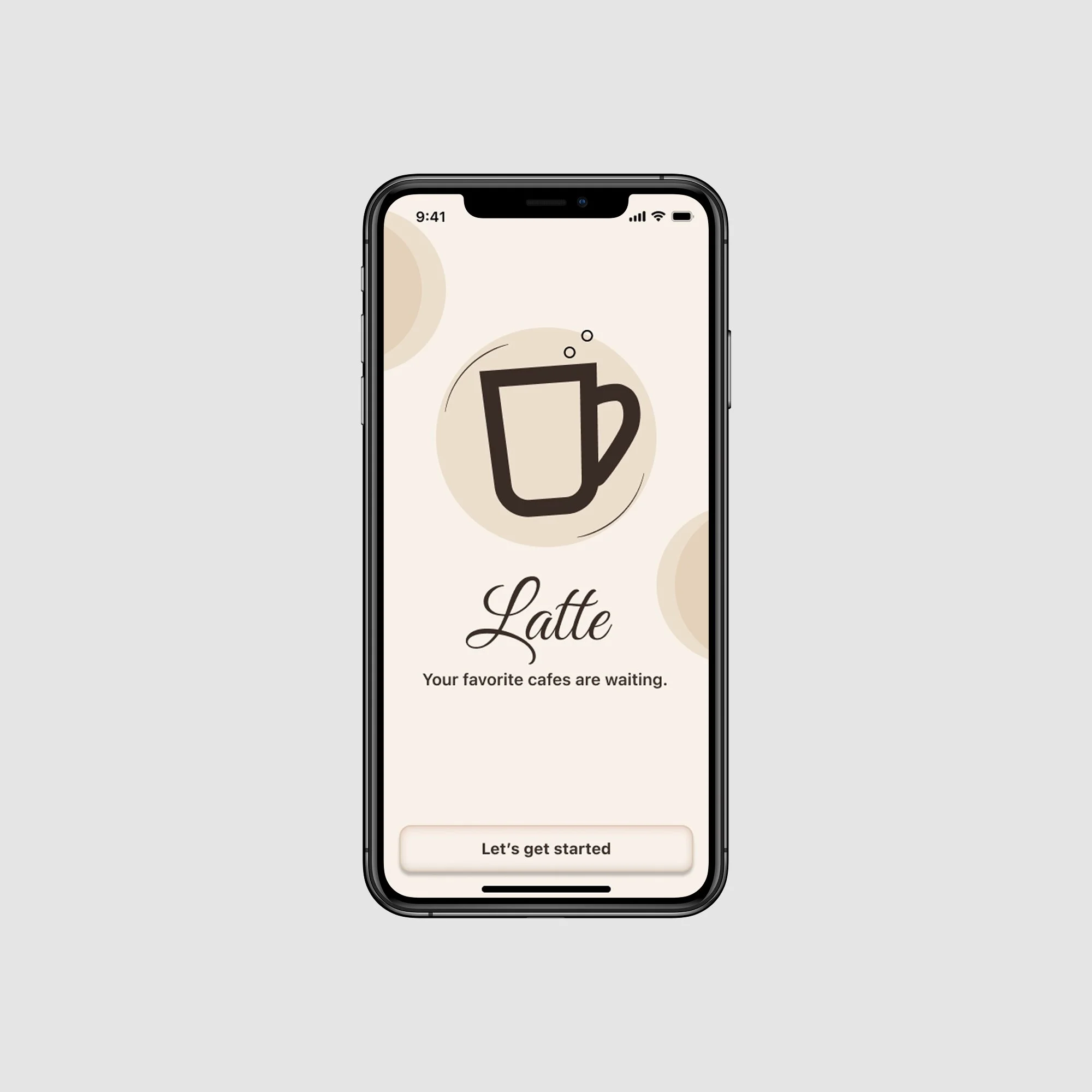
RayWave Media
RayWave Media launched a freemium mobile-first product two years ago, building a strong base of free users.
Problem: The app lacks clear calls-to-action (CTAs) in signup, sign-in, and in-product flows to promote subscriptions or communicate premium value leading to missed conversion opportunities.
Objective: Uncover best practices and actionable opportunities for freemium-to-premium conversions, then design non-disruptive flows that encourage upgrades while preserving the free experience.
(scroll for case study)
TLDR
Spotify
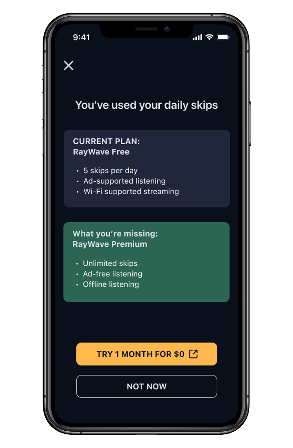
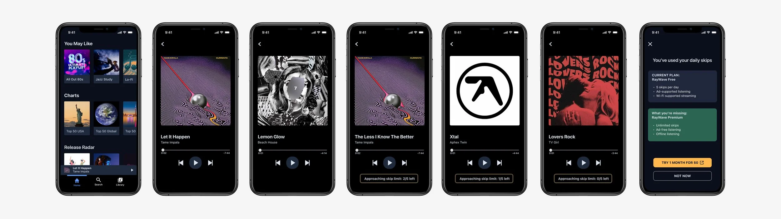
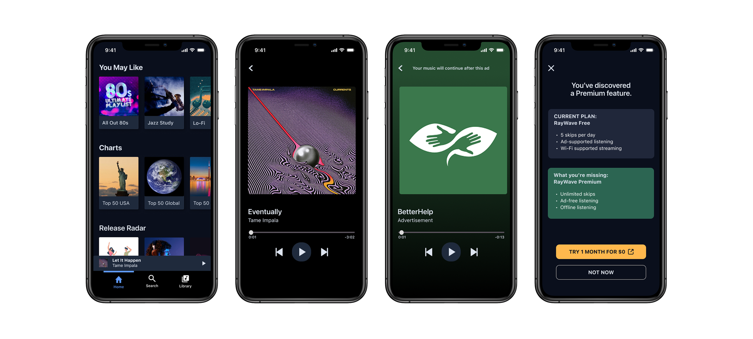
Modals triggered by skip limits that highlight premium value at moment of frustration
“Why Join Premium?” framing
Friction-timed prompts drive engagement
Users are targeted during peak frustration points.
Background
I analyzed three leading freemium media platforms to identify effective premium conversion patterns in signup, onboarding, and in-product flows.
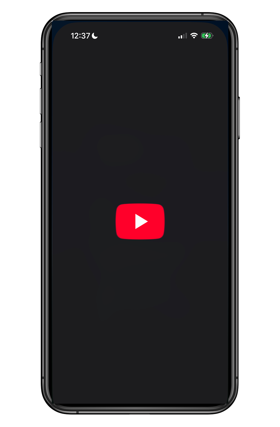
Youtube
Urgent anti-adblock prompts with “No interruptions” messaging and bold CTAS
Timely mid-video ad banners
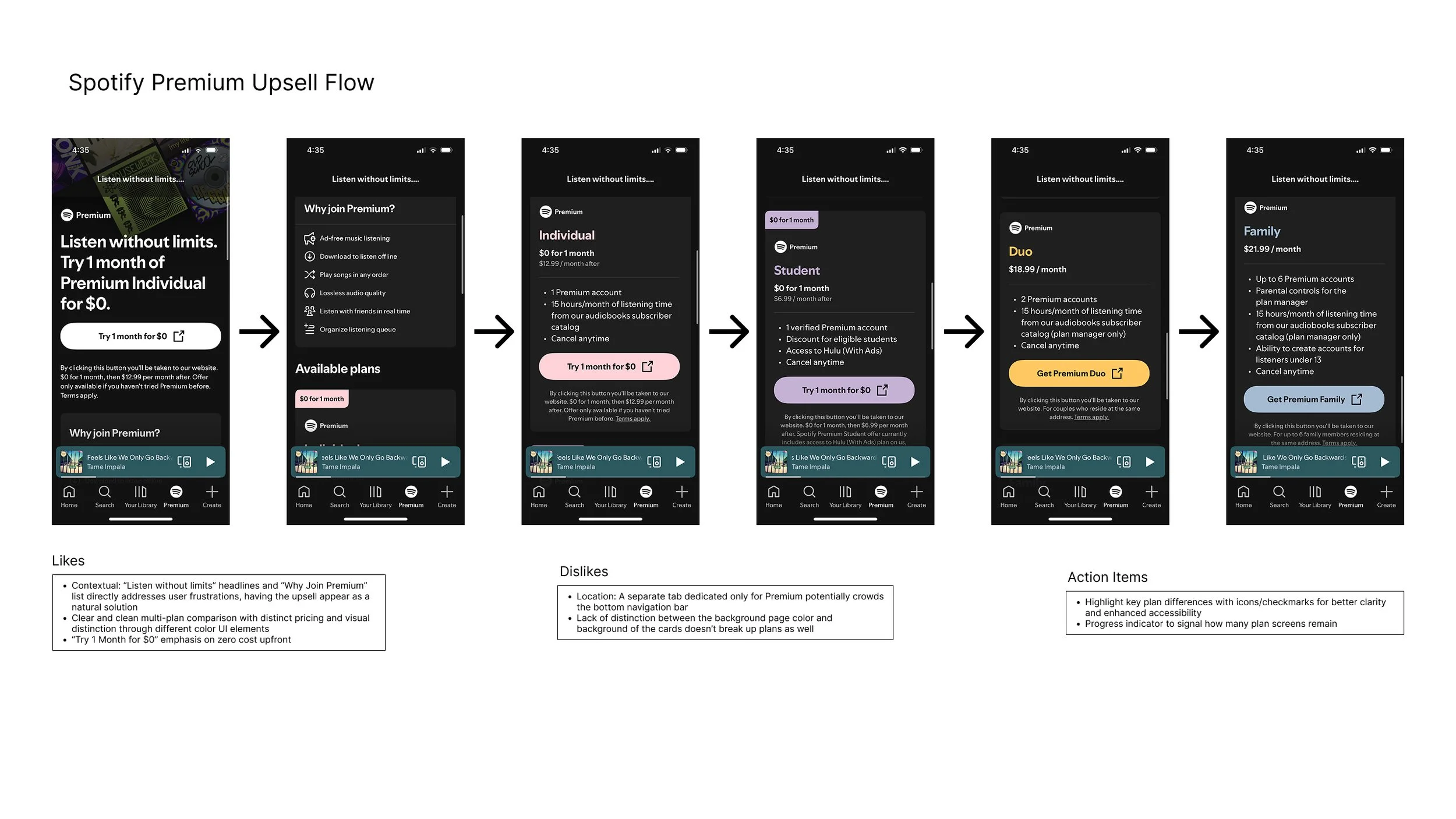
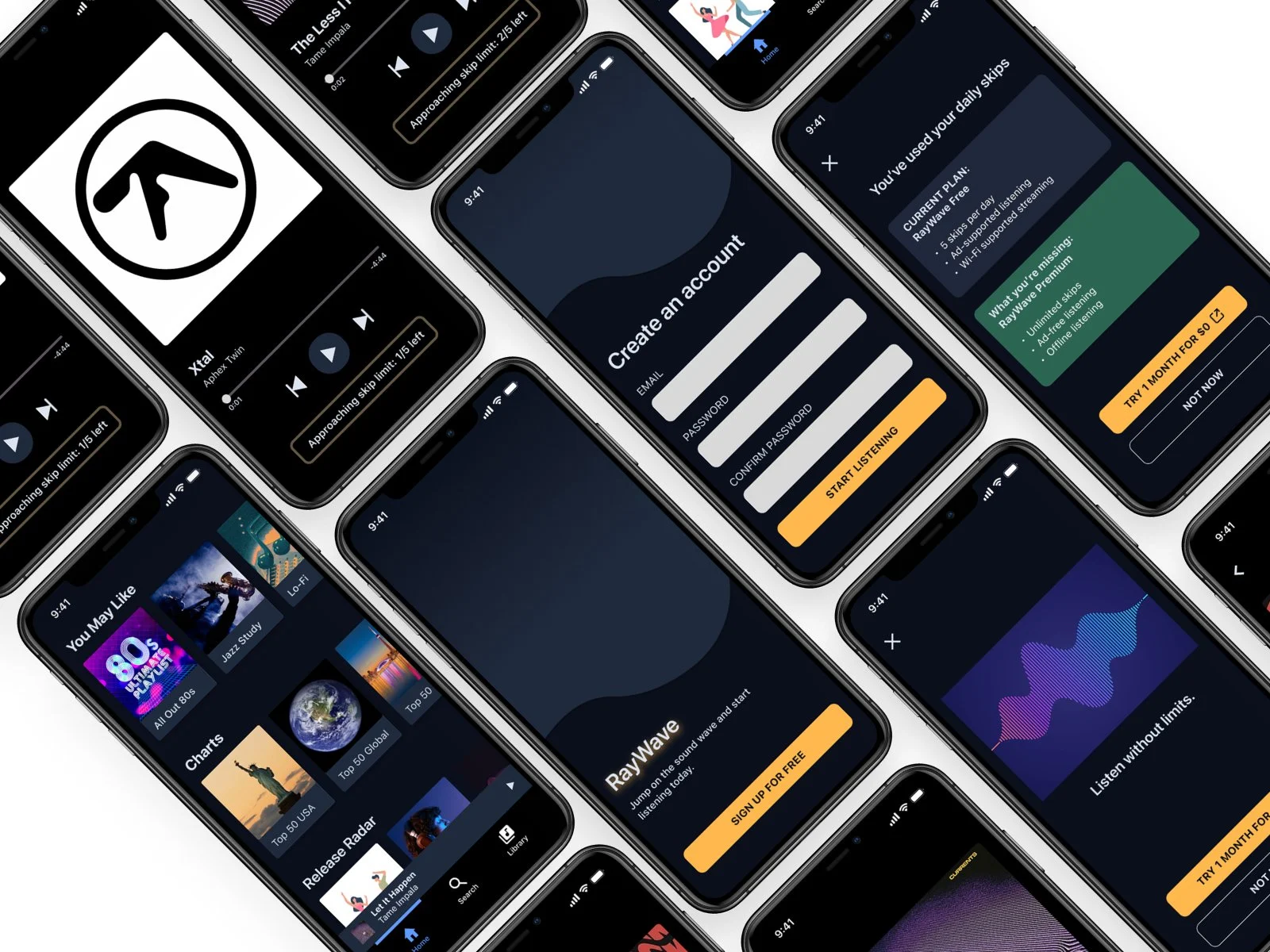
Example of upsell flows created for each platform
FINDING 1
Pandora
Generous skip alternatives (short sponsor ads) to reduce friction
Benefit checklists for scannability
FINDING 2
Empathetic messaging builds trust
Emotional copy fosters connection.
FINDING 3
Concise bullets improve readability
Dense paragraphs reduce scannability.
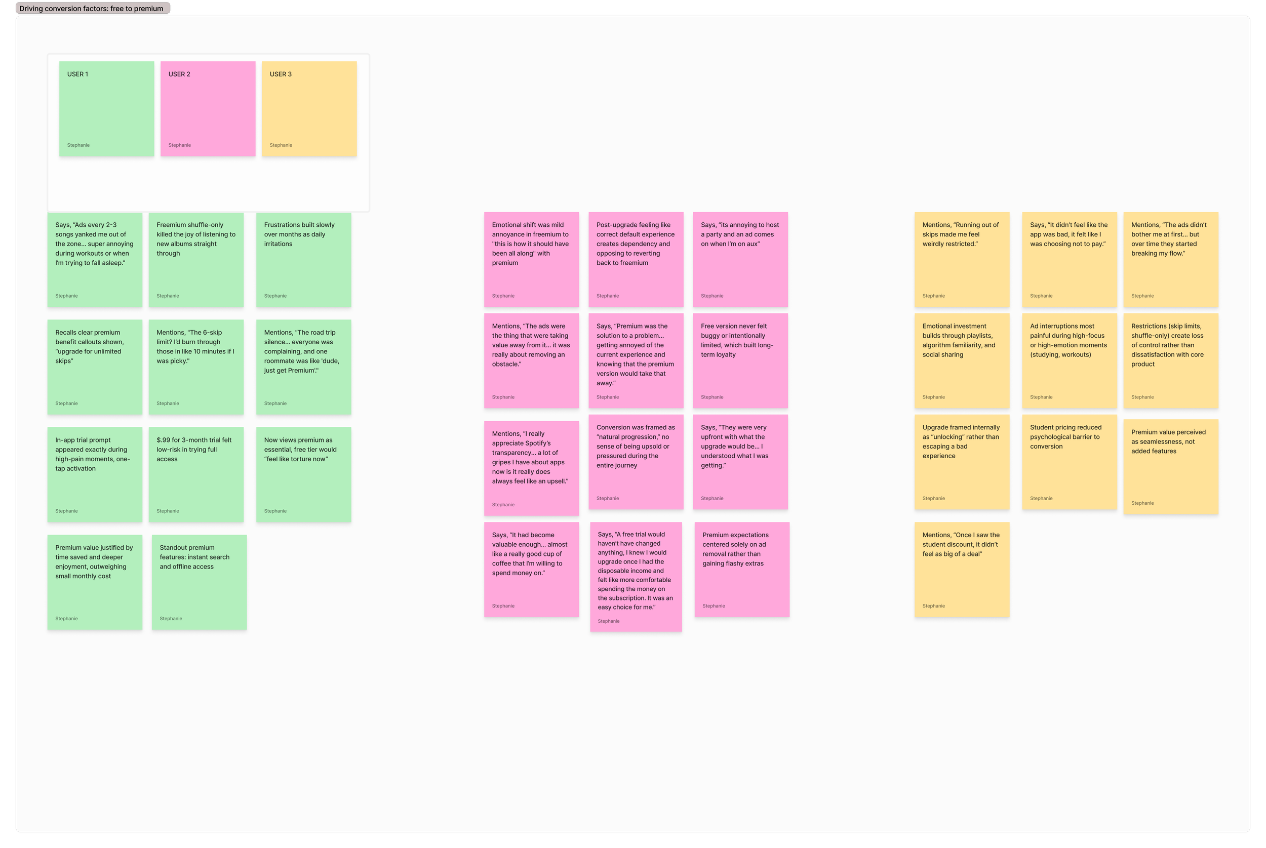
Research Synthesis
I grouped insights into themes using affinity mapping; identifying shared behaviors, frustrations, and opportunities.
Primary Research
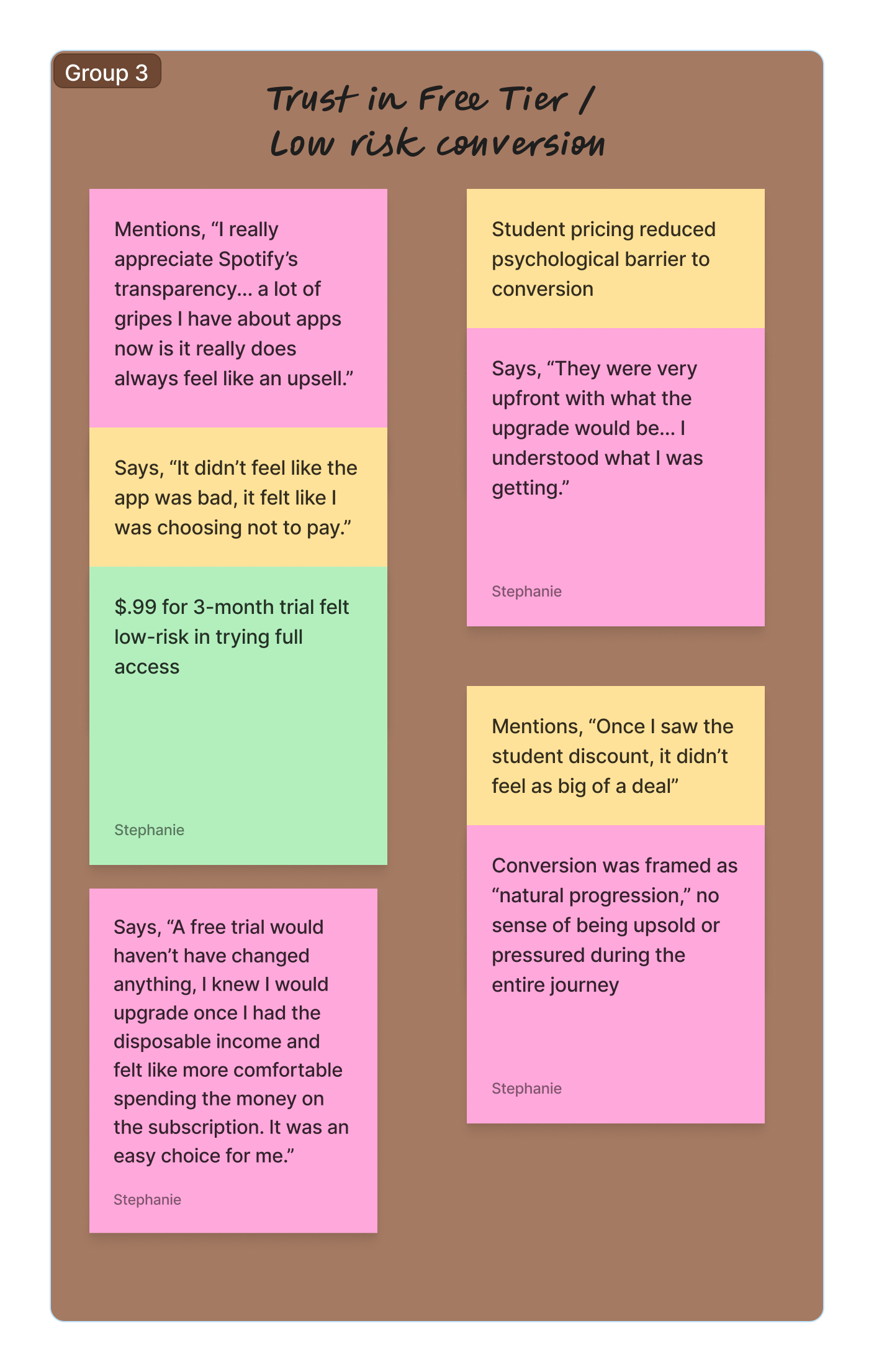
A trustworthy free tier paves the way.
When the free experience delivered consistent value, premium was perceived as progression instead of pressure. Participants responded better to transparency over hard-sell tactics.
I conducted surveys and moderated, think-aloud user interviews to identify key drivers of premium conversion.
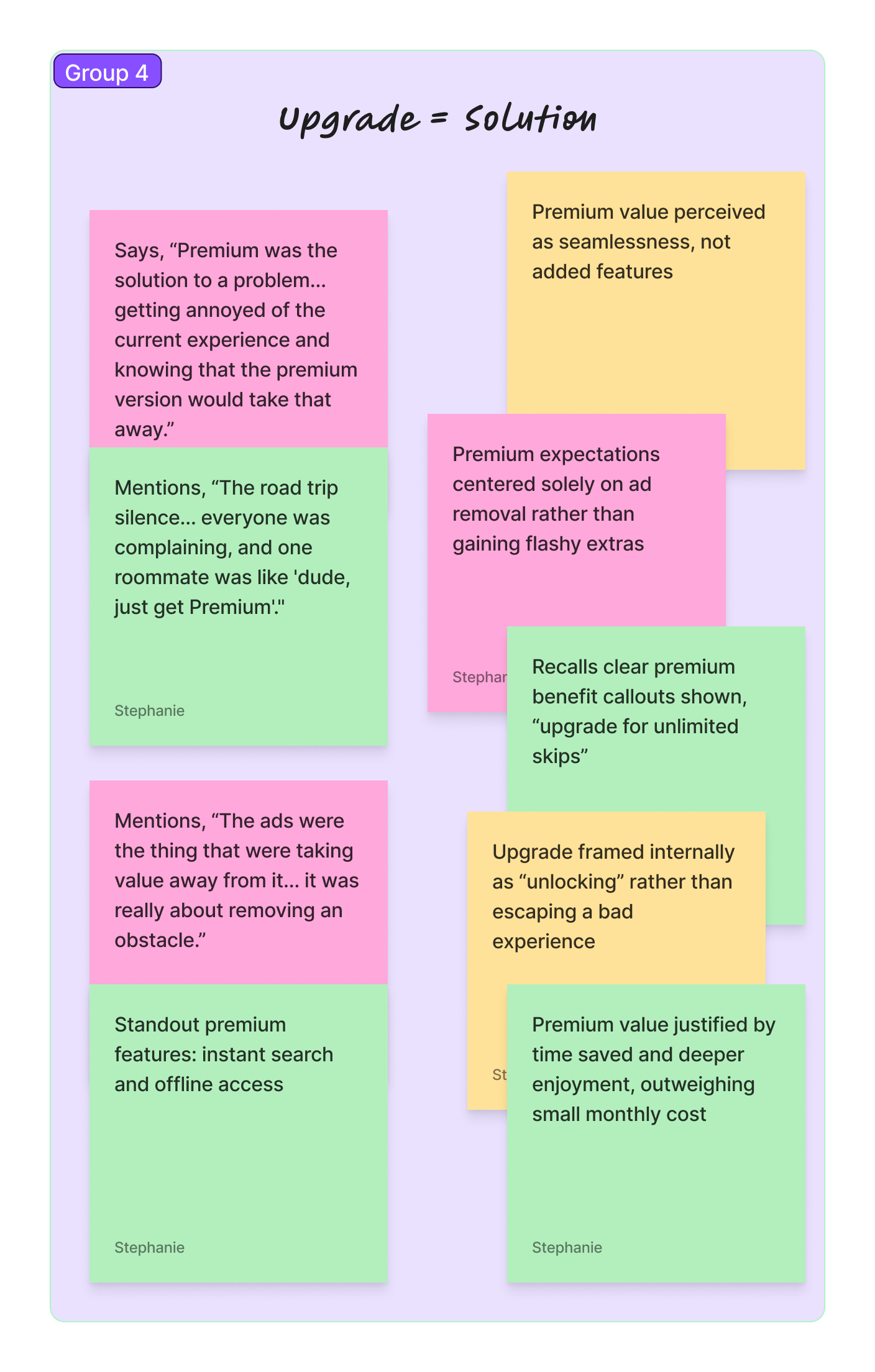
Premium is for problem-solving, not novelty.
Rather than chasing new features, users mainly upgraded to restore the seamless experience they loved. Premium was framed as the practical fix to their existing pain points.
Participants matched the target audience:
tech-savvy adults aged 20-35 that successfully converted from free to premium tiers on competing platforms.
The group featured a balanced 50/50 gender split and diverse U.S. locations to capture different perspectives.
FINDING 1
FINDING 2
The four key themes that generate premium conversion…
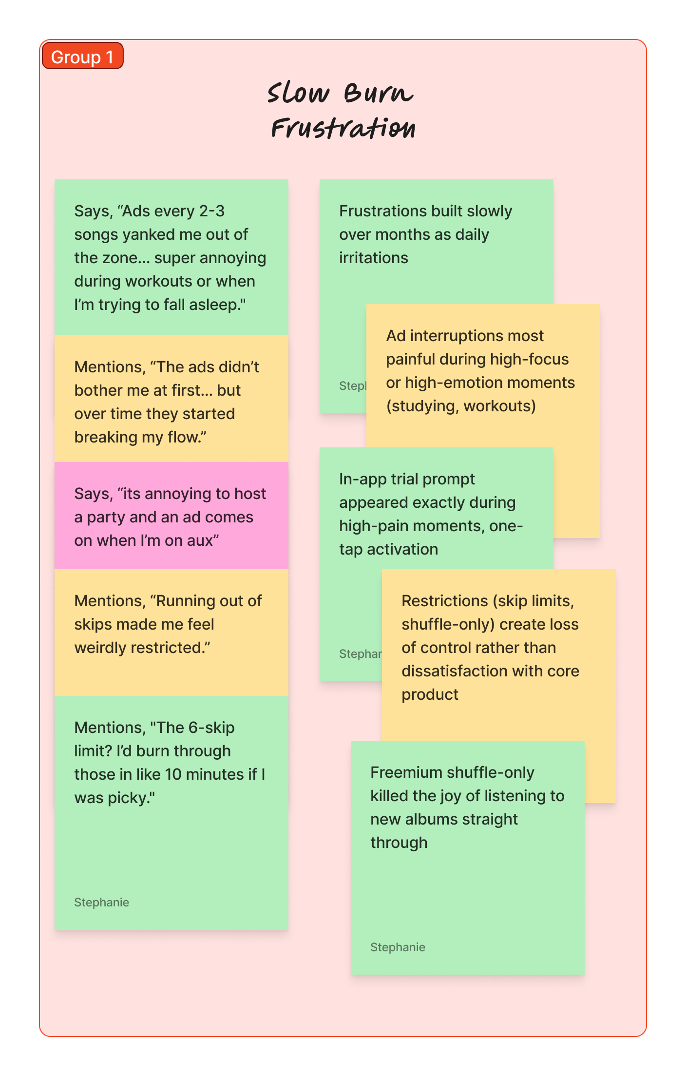
Free-tier frustrations begin as minor irritations but build over time, especially when ads/limits disrupt personal flow or social moments. This gradual pain creates openness to upgrading without feeling manipulated. Users stay engaged enough for the friction that motivates change.
1. Create gradual low level frustration.
KEY TAKEAWAY:
Design limits that feel fair at first but could build friction with repeated use.
“Ads every 2-3 songs yanked me out of the zone... super annoying during workouts.”
QUOTE 2
“The ads didn’t bother me at first… but over time they started breaking my flow.”
QUOTE 1
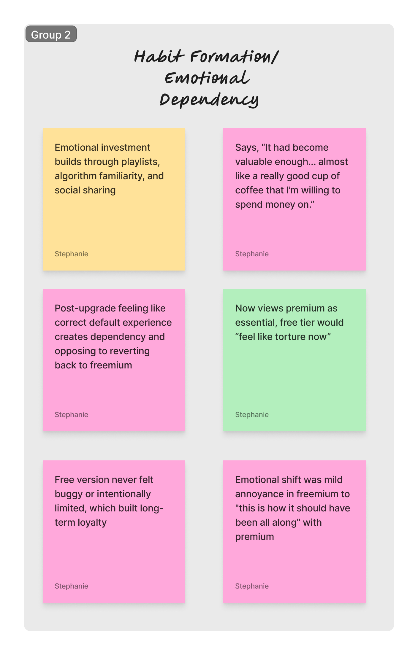
Consistent free use builds deep habits, integrating the app into daily life. Emotional dependency heightens frustration over time. Downgrading to freemium feels like a loss, while premium locks in stronger loyalty.
2. Users need habit formation and emotional dependency in the experience.
KEY TAKEAWAY:
Prioritize features that encourage early habit-building to foster user dependency.
“It became valuable enough... like a good coffee I’m willing to buy.”
QUOTE 2
“Going back to free tier would feel like torture now.”
QUOTE 1
A reliable free tier builds trust, preventing abandonment and framing premium as a choice rather than coercion. Low-risk elements (cheap trials, contextual prompts, intentional timing) reduce hesitation and increase upgrade likelihood.
3. The free tier needs enough value to develop trust with the user.
KEY TAKEAWAY:
Emphasize trust. Avoid aggressive upsells and shift towards clear, upfront value comparisons.
“I really appreciate Spotify’s transparency.”
QUOTE 2
“A lot of gripes I have about apps is it always feel like an upsell.”
QUOTE 1
Users frame premium as the solution to specific pain points (removing ads/limits) rather than acquiring new features. It unlocks the “real,” version of an experience they already love, wth saved time and deeper satisfaction post-upgrade.
4. The Upgrade is the solution to the frustration.
KEY TAKEAWAY:
Position premium as “friction removal” with clear callouts of resolved pain points to make the decision feel empowering.
“The ads were taking value away... it was about removing an obstacle.”
QUOTE 2
“Premium was the solution... I’d get annoyed and realize premium would fix this.”
QUOTE 1
Ideation
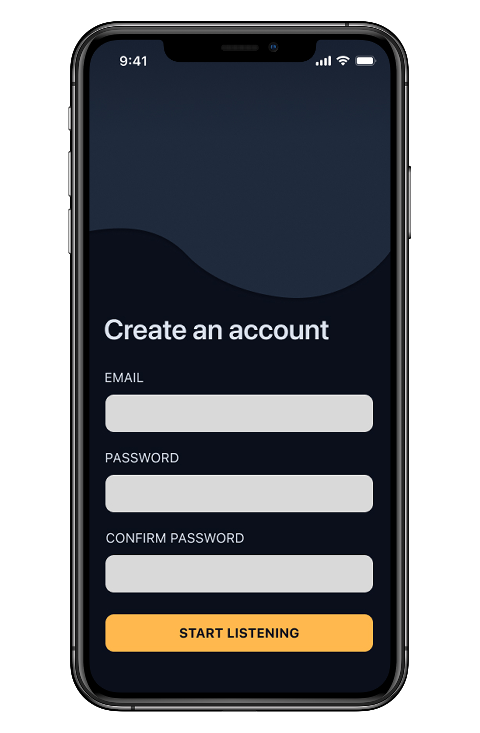
I defined the overall structure using user flows for detailed task paths and intuitive journeys.
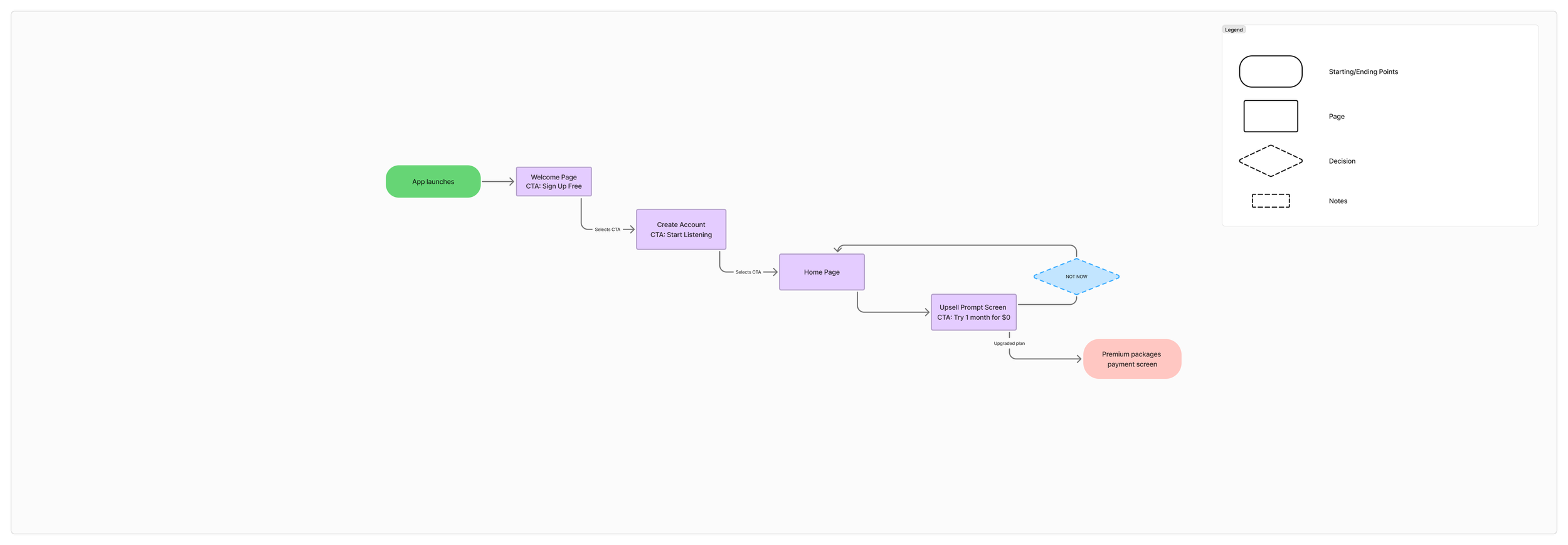
Example: Onboarding user flow
The Design Process
Wireframes focus on structure, information hierarchy, CTA placement, and non-disruptive premium triggers.
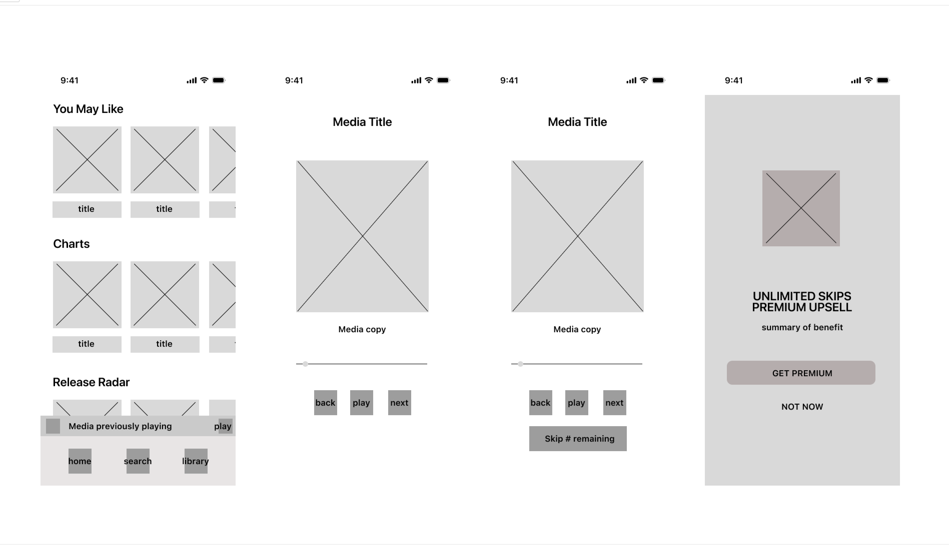
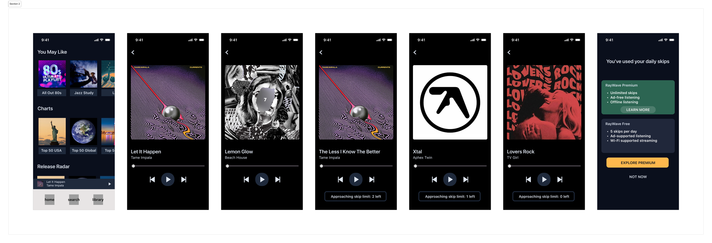
Low-Fidelity Designs added visual hierarchy, color blocks and content placeholders for more realistic flows.
Refinements for High-Fidelity Designs based on feedback:
Shift to empathetic, value-led copy
Adjusted low-pressure CTA tone
Visual improvements around friction indicators
I moderated two rounds of think-aloud usability tests.
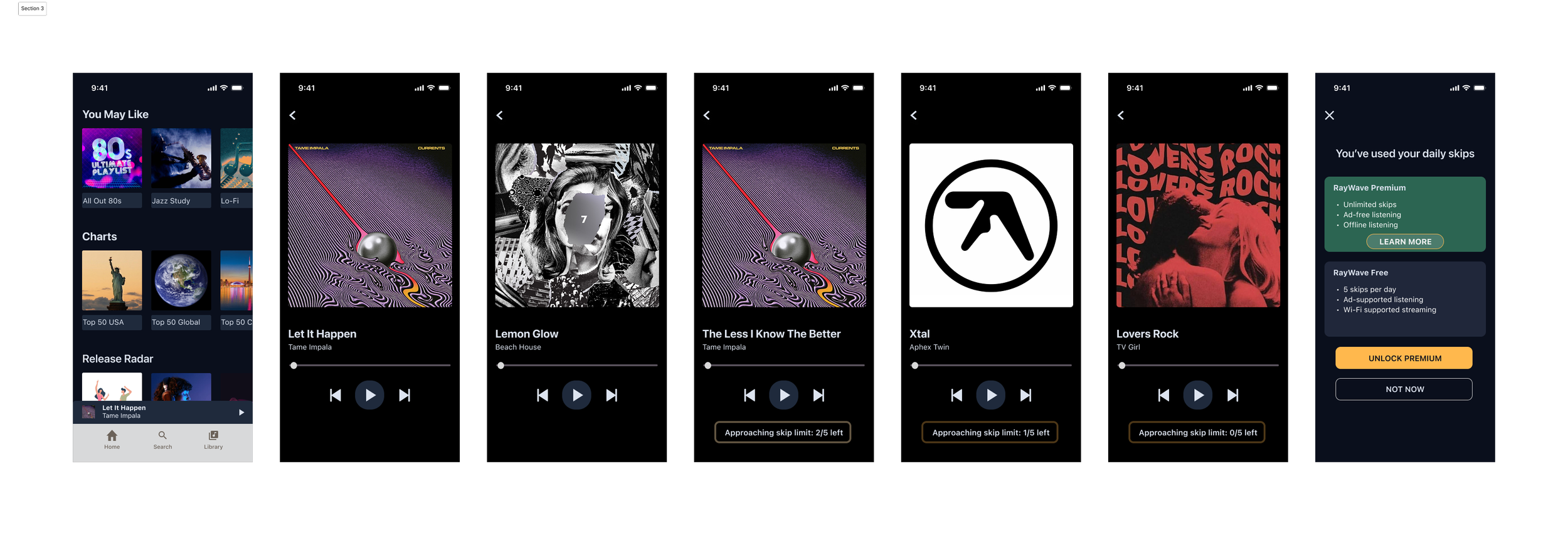
Feedback from the final round confirmed less disruption and clearer navigation cues on premium CTAs, resulting in higher user trust and willingness to upgrade.
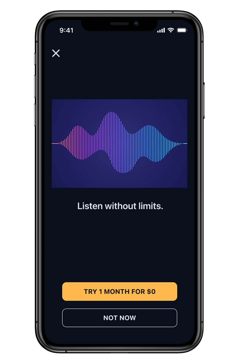
“The 0$ trial caught my eye.”
QUOTE 2
“Ugh I expected this, still annoying, but I expected this.”
Participants felt trapped by the upsell prompt due to limited exit options.
SOLUTION:
Added a clear secondary exit to reduce pressure.
QUOTE 1
PROBLEM:
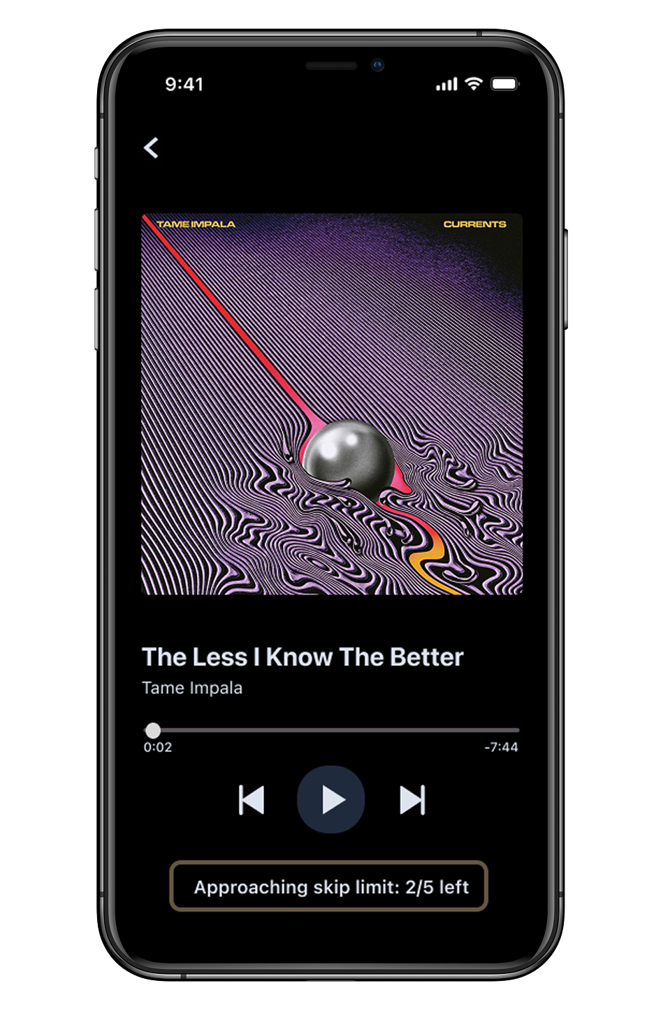
Lack of clarity around skip limits served as a key driver of frustration.
SOLUTION:
Introduced “Skips left: 2/5” indicators for transparent limits, minimizing uncertainty and frustration at the trigger moment.
QUOTE 3
“I think if I didn’t get the warnings leading up it would be worse...”
PROBLEM:
CTA buttons unexpectedly led to an external page, making them feel less accessible and trustworthy.
SOLUTION:
Added visual indicators to CTA buttons to clearly signal navigation changes.
PROBLEM:
PROBLEM:
Upsell language was perceived as too sales-focused, hindering emotional connection.
SOLUTION:
Adopted warmer, low-risk messaging to emphasize flexibility and reinforce trust.
These refinements shaped the final conversion flows below that preserve the free experience while encouraging upgrades at the right moment.
Key Deliverables
Onboarding & Sign Up
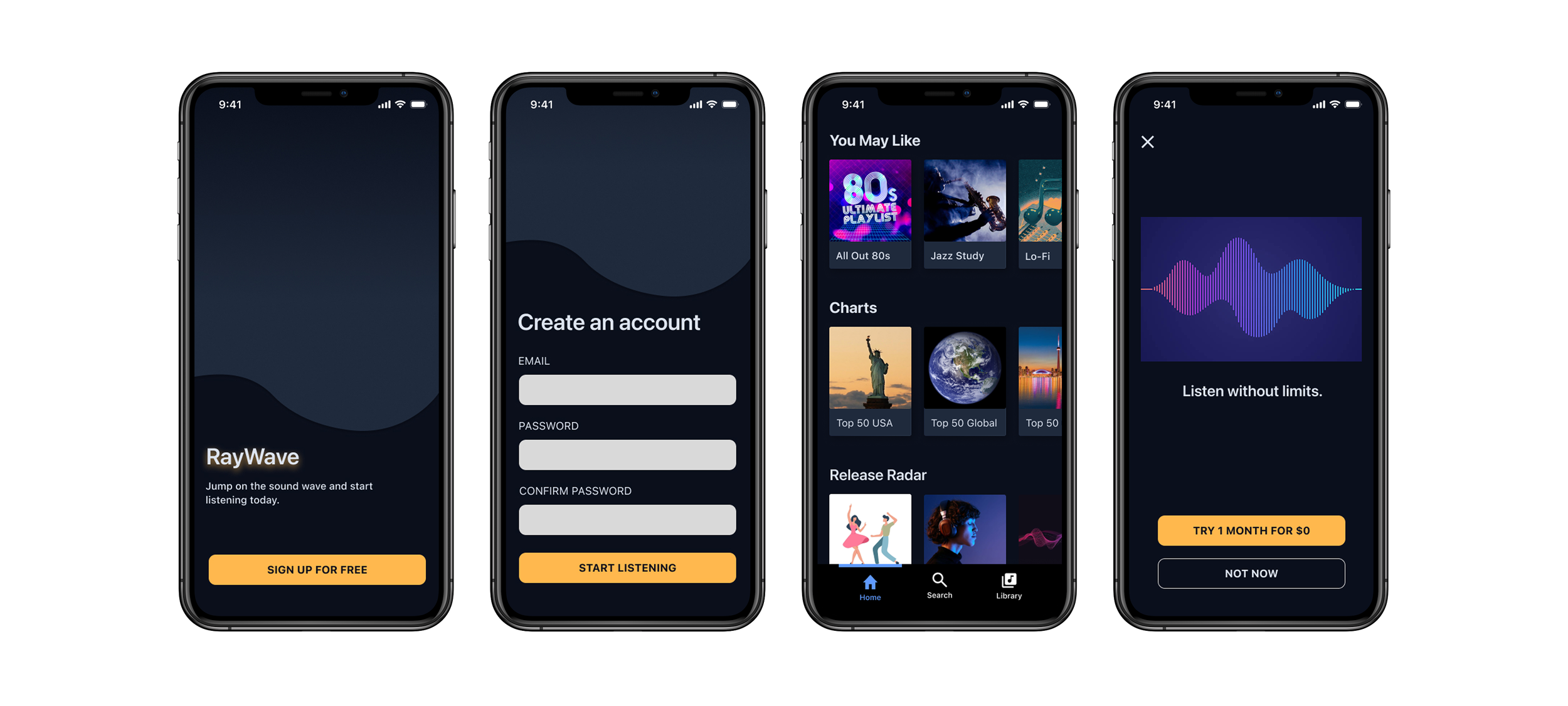
Friction-timed Skip Limit Nudges
Ad-interruption & Premium Discovery
By combining user research, strategic flows, and continuous usability testing, I discovered the power of intuitive experiences that convert users organically.
Final Reflection
This project deepened my understanding of balancing user delight with business outcomes and reinforced the power of iterative, empathy-driven design.