Broad-Gauge
Case Study of Website Redesign
Launched: January 19, 2026
(scroll for case study)
TLDR
Objective: Enhance user experience through better navigation, visual storytelling, and consistent design language.
Yelp
Profile access
Personalized experience
Address navigation friction
Stakeholders emphasized creating a more straightforward path through the site so time-pressed executives (HR leaders, CEOs, and private equity sponsors) can locate the insights they need rapidly and effortlessly.
Research
I met with the CEO, Head of Marketing, and development team in stakeholder meetings to understand business priorities and align on site experience goals.
Methodology
I looked at tech startups, etc.
Competitive Analysis
Google Maps
Maps, photos and directions
Real-time data
GOAL 1
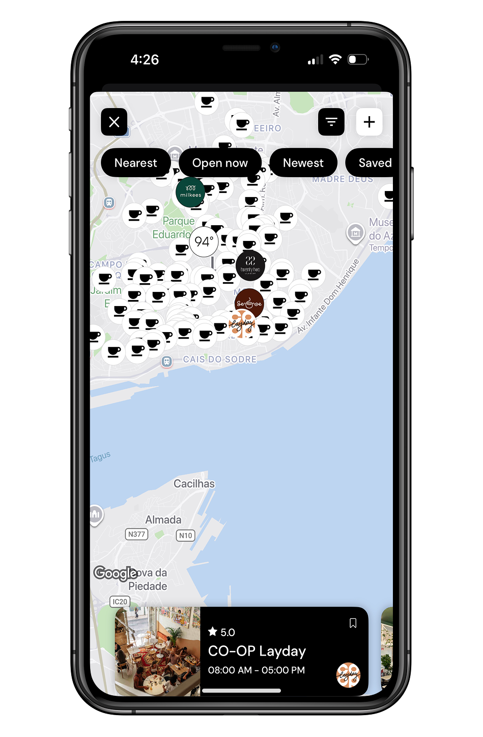
Roasters
Coffee discovery
In-depth offerings
GOAL 2
Bring more personality in line with brand identity
The group wanted the design to feel warmer and more distinctive while staying sophisticated, incorporating purposeful imagery and narrative elements to help explain intricate ideas (such as culture rhythm, workforce resilience, and financial outcomes) in an engaging, lasting way
Map-based local search
User reviews
GOAL 3
Achieve uniform design across all pages for a trustworthy presence
Everyone agreed on the value of consistent type choices, layout structure, spacing, and overall visuals to clearly position Broad-Gauge as a high-caliber, dependable tool in the people analytics field.
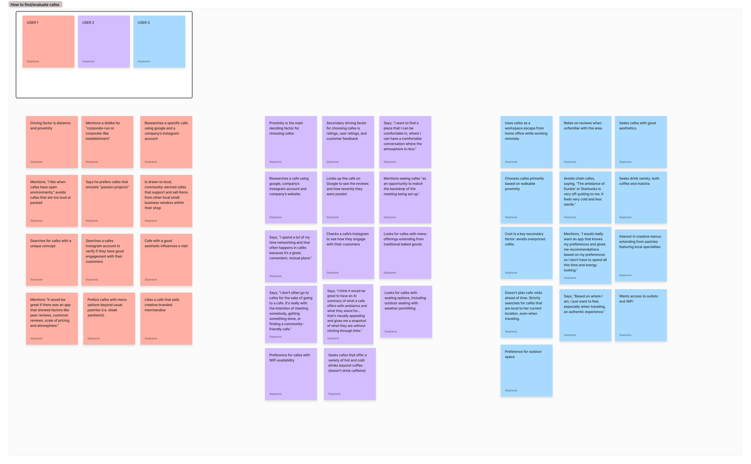
Primary Research
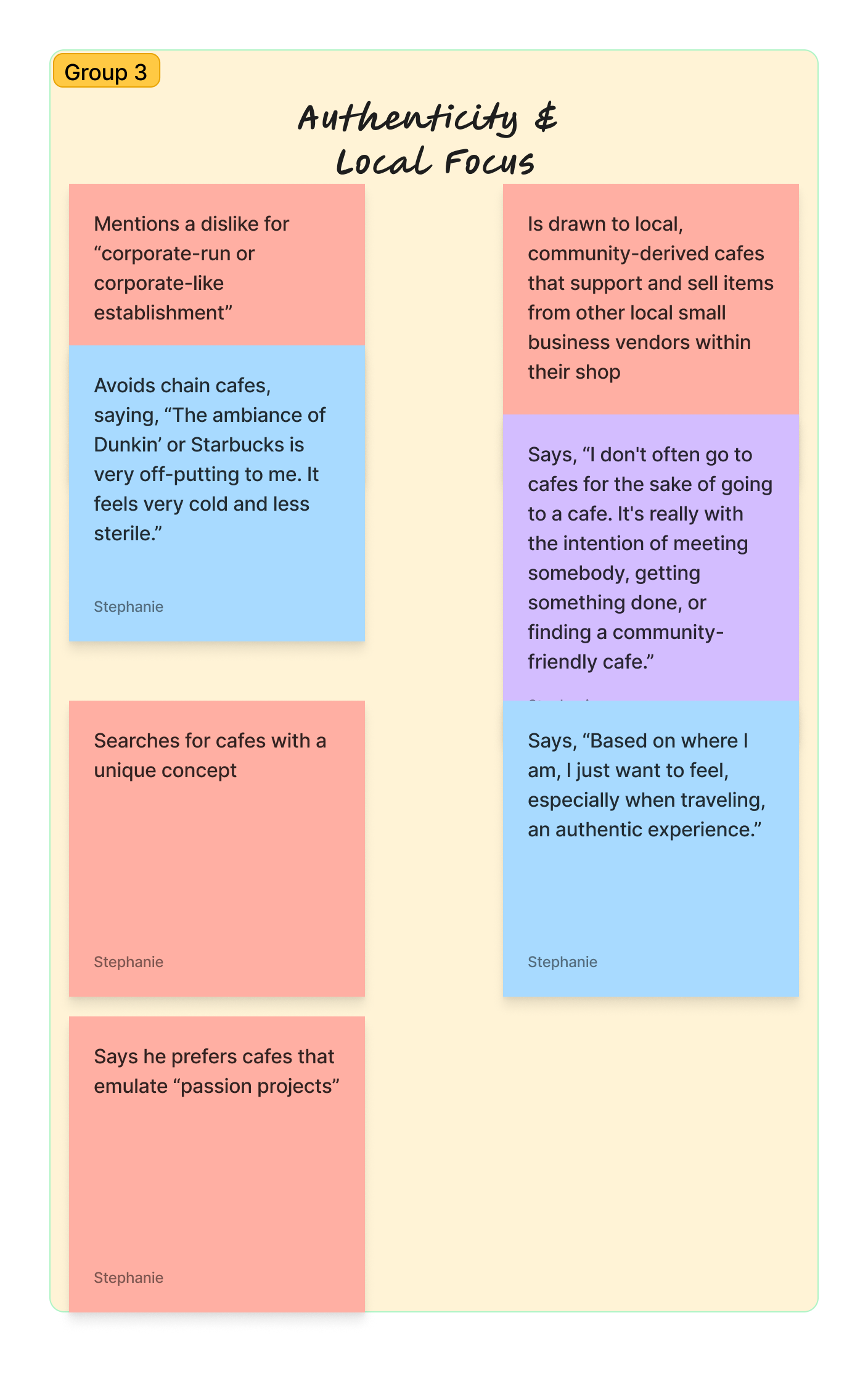
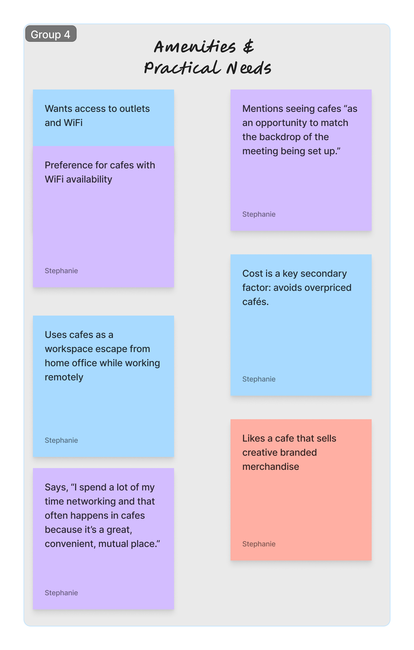
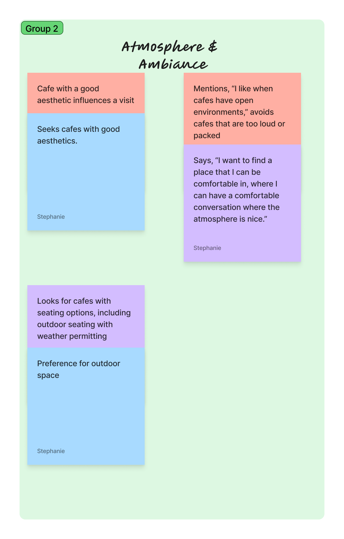
Environment matters as much as proximity.
People aren’t strictly choosing cafes based on proximity. They’re looking for spaces that reflect the atmosphere they personally enjoy.
I conducted surveys and semi-structured user interviews to validate secondary trends and uncover pain points around cafe discovery, preferences, and social connection.
Methodology
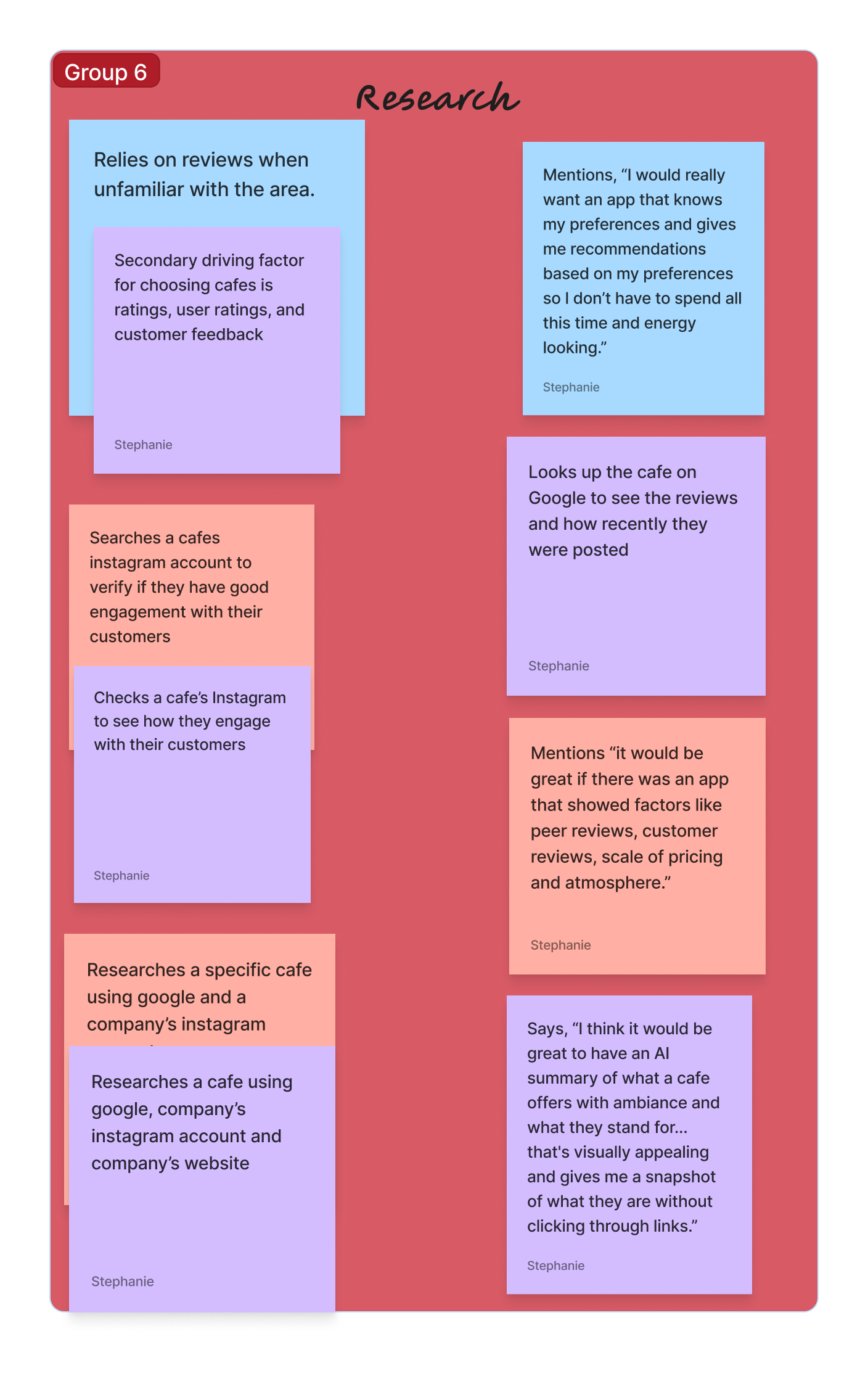
Clarity matters as much as accuracy.
Users often feel frustrated trying to piece together information from multiple sources in finding a cafe right for them.
Participants were between the ages of mid-20s to 40s and a mix of coffee and matcha drinkers with different cafe discovery habits. Two-thirds lived in New York City and one-third in San Diego, capturing perspectives from two major urban markets with strong cafe cultures.
Participant Overview
FINDING 1
FINDING 2
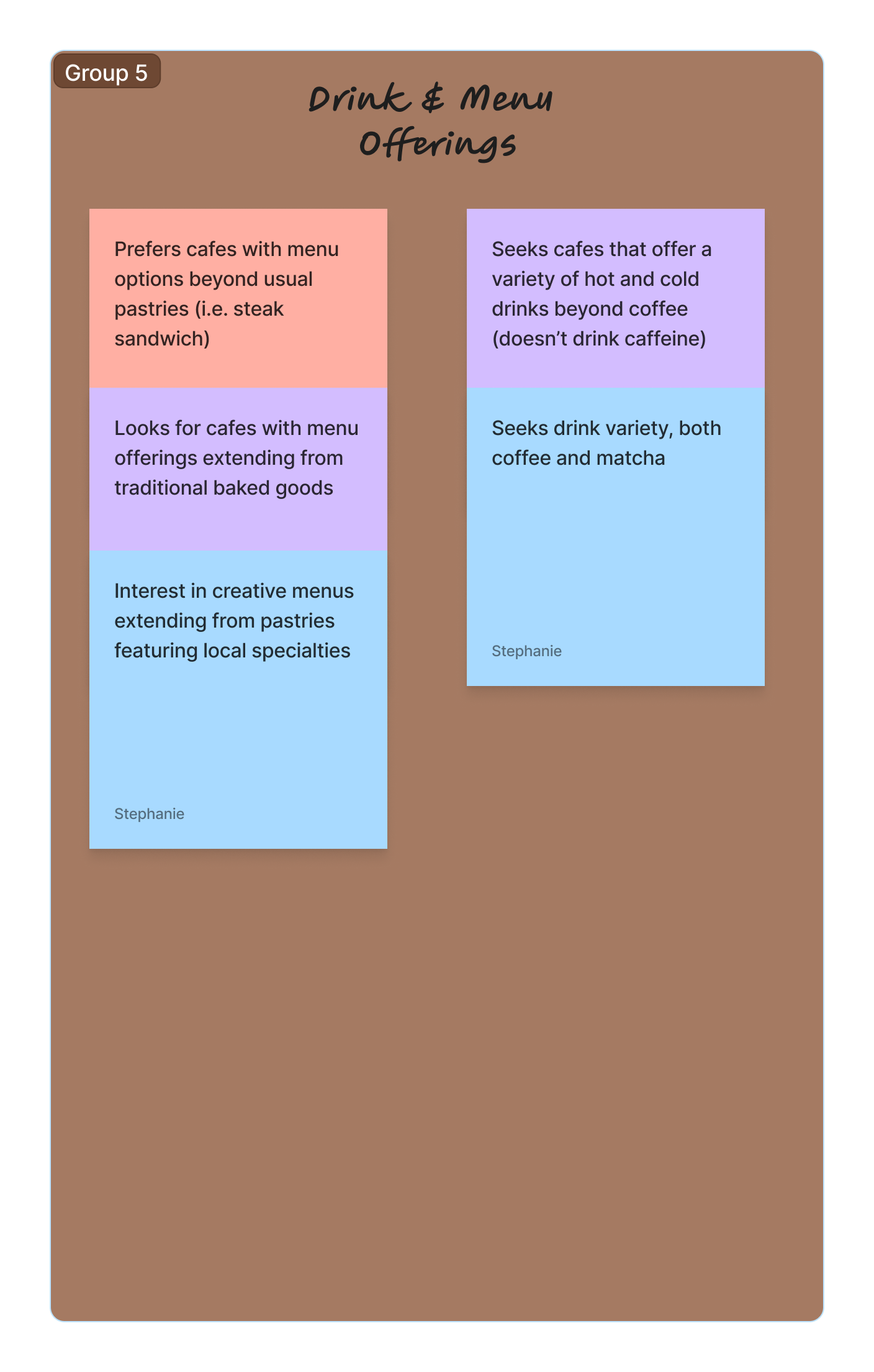
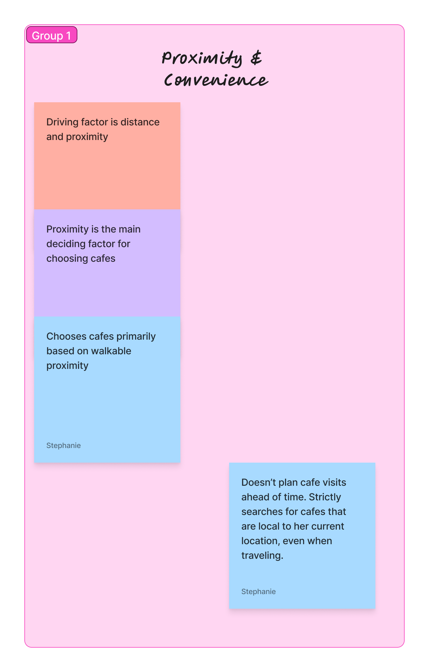
Research Synthesis
I grouped interview insights into themes using affinity mapping; identifying shared behaviors, frustrations, and opportunities.
Thematic Analysis & Affinity Mapping
Social Jobs
Be seen as someone who supports small businesses
Share discoveries that impress others
Job Statement: Reduce the time it takes to select a cafe to visit.
DESIGN SOLUTION
AI ambiance summaries: overviews generated from reviews and photos.
HIGHLIGHT CAFES THAT EMBODY AUTHENTICITY, CREATIVITY AND A SENSE OF BELONGING?
DESIGN SOLUTION
Features tab: reflects the cafe’s offerings at a quick glance.
These statements encapsulate user needs and core motivations.
Jobs-to-Be Done
Emotional Jobs
Ease the anxiety of visiting somewhere new
Feel connected to the community
Main Jobs
Explore cafes
Choose locations
Related Jobs
Filter cafes by preference
Compare cafe atmospheres
HELP USERS DISCOVER CAFES THAT ALIGN WITH THEIR PREFERENCES AND INTENTIONS?
How might we…
DESIGN SOLUTION
Profile cards: brings key details and highlights into one centralized place.
HELP USERS BETTER UNDERSTAND A CAFE’S AMBIANCE AND EMPOWER THEM IN THEIR DECISION-MAKING?
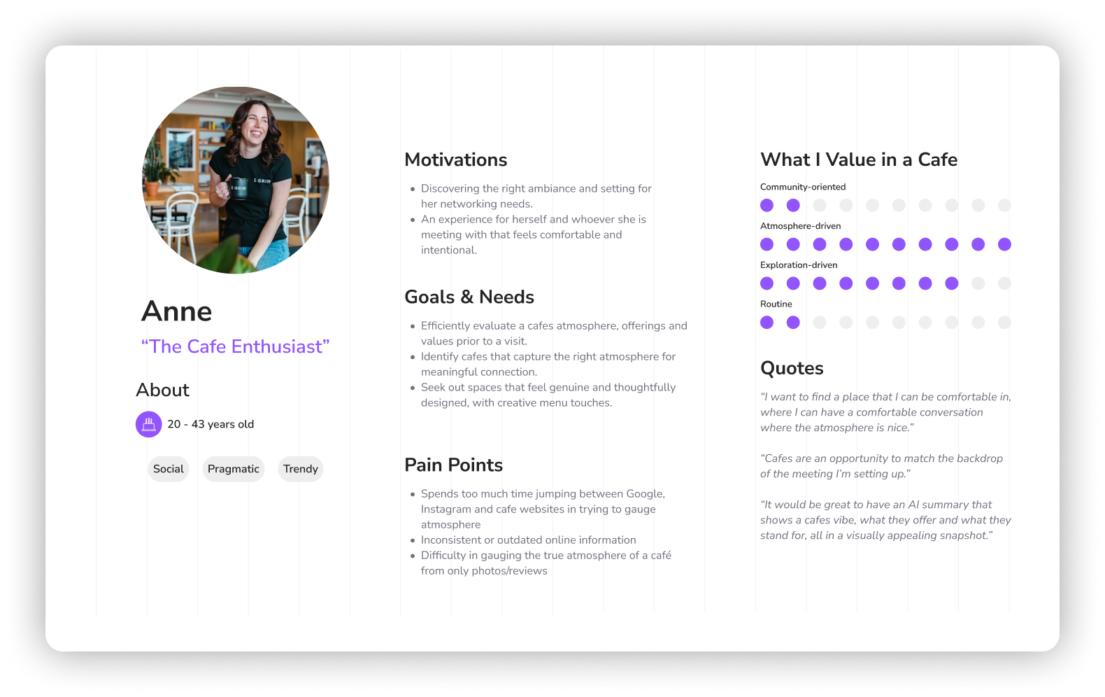
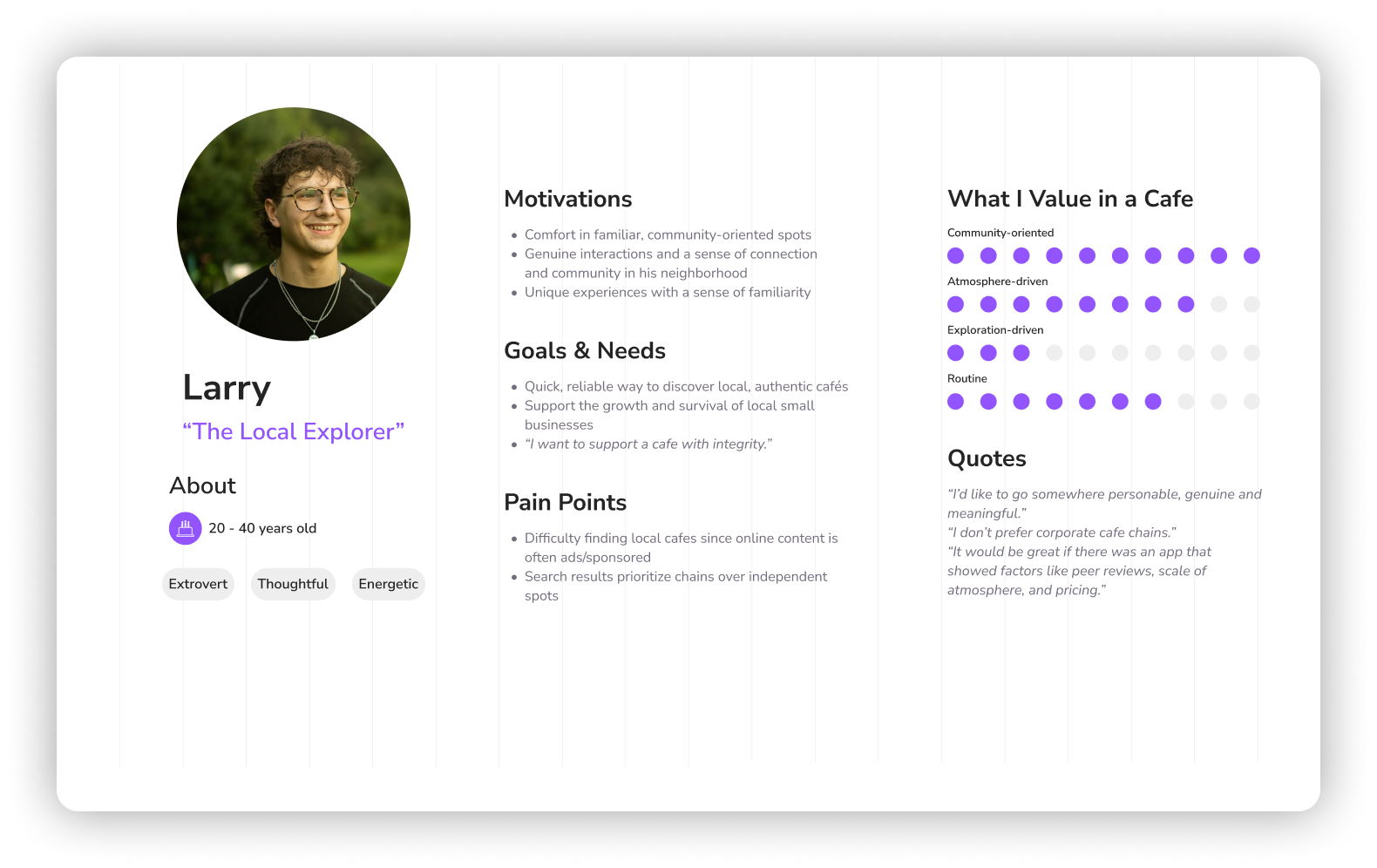
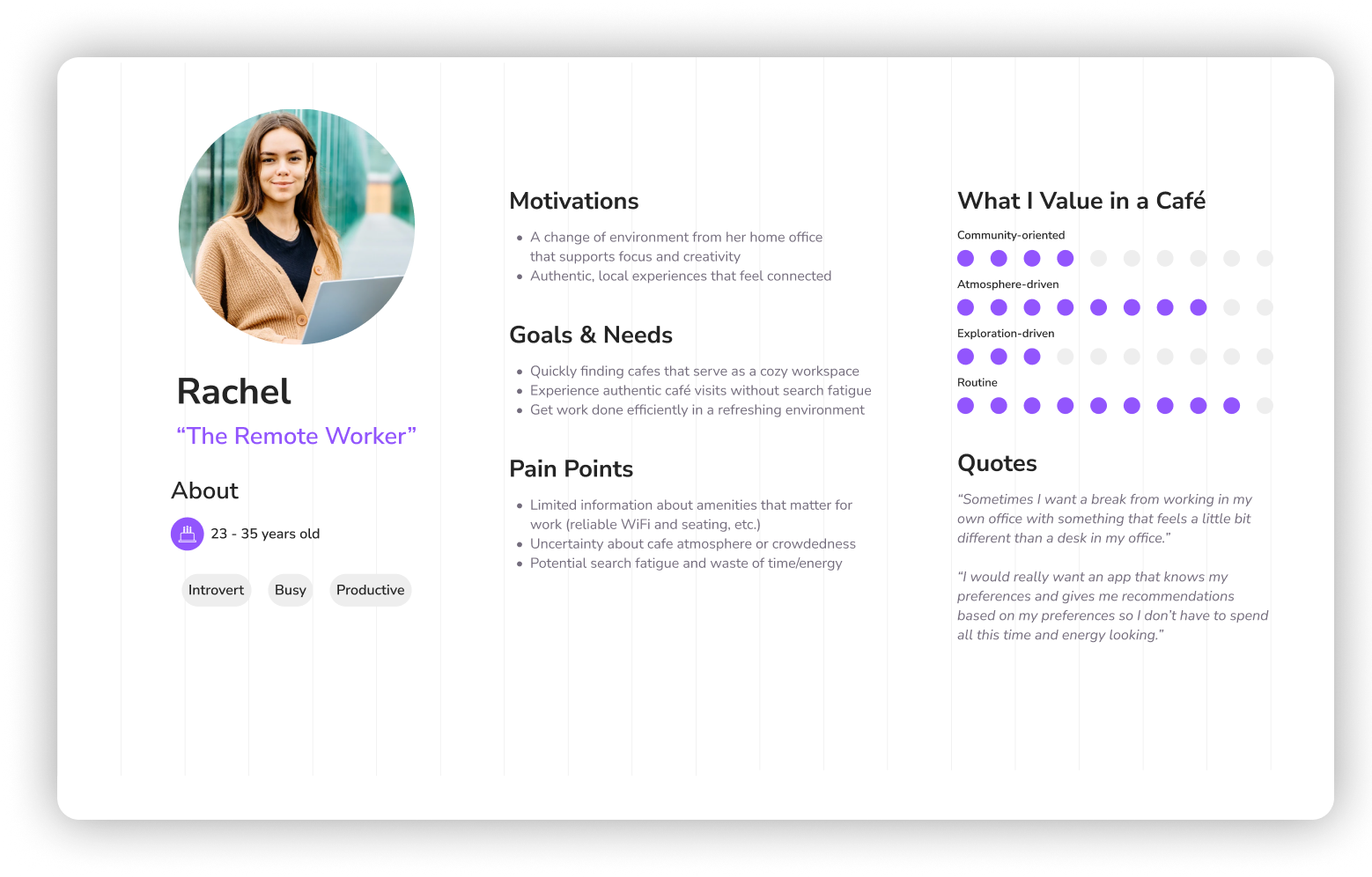
User Personas
Created to form a deeper understanding of user goals, needs, behaviors and experiences. They represent real people for design decisions.
These insights and synthesis outputs directly informed the ideation, wireframing and high-fidelity design phases that followed.
Ideation
I translated key user needs and jobs-to-be-done into actionable user stories, keeping solutions focused on real goals.
User Stories
As a…
cafe enthusiast
local explorer
remote worker
I want to…
filter the search results
discover cafes in my neighborhood
view a cafe’s details
So that I can…
find cafes that match my tastes
feel connected to the community
evaluate a cafe and plan a visit
Example: Onboarding user flow
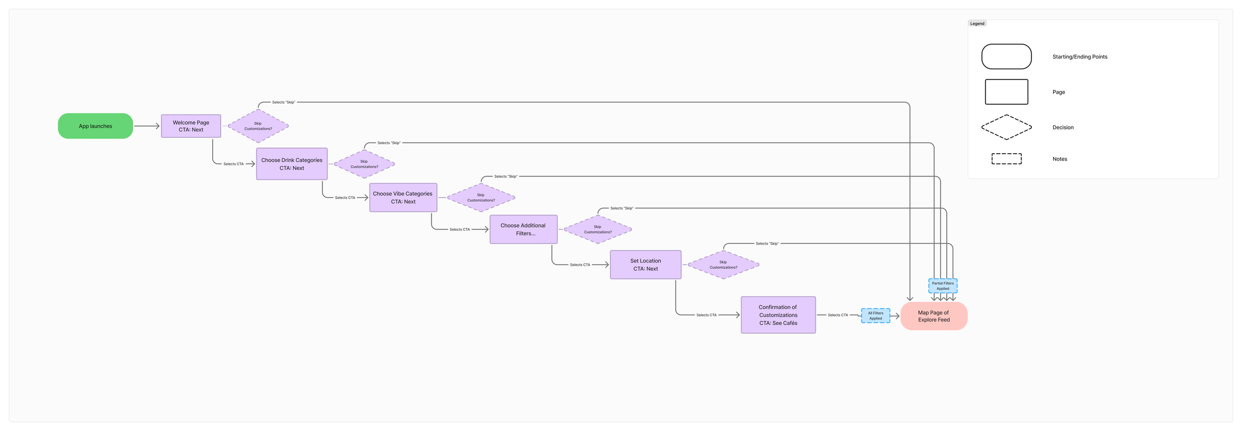
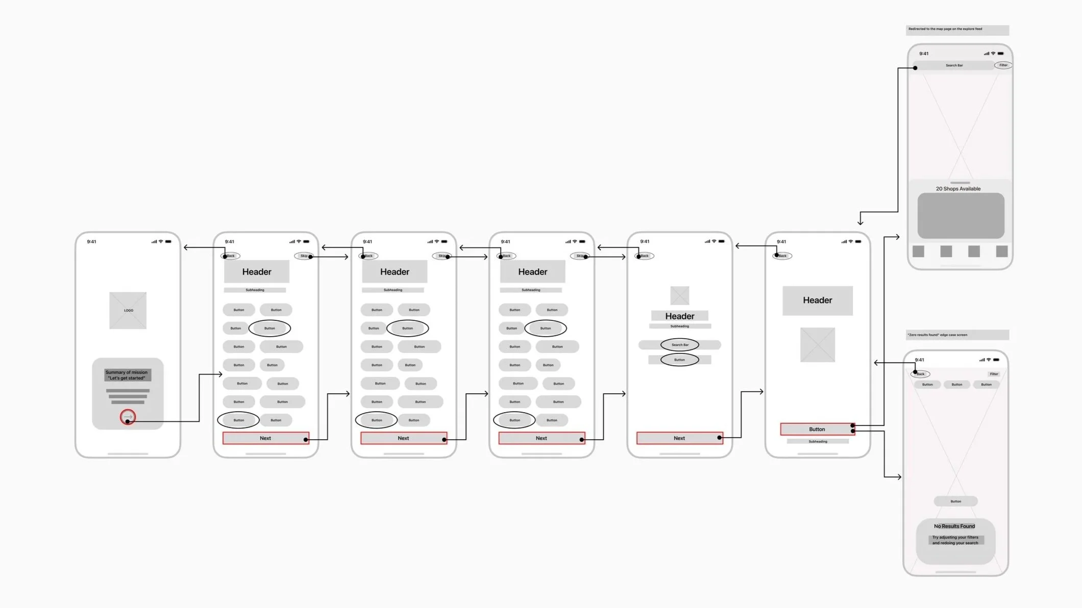
I defined the app’s overall structure and navigation logic, creating sitemaps for hierarchy and user flows for clear task paths.
Information Architecture
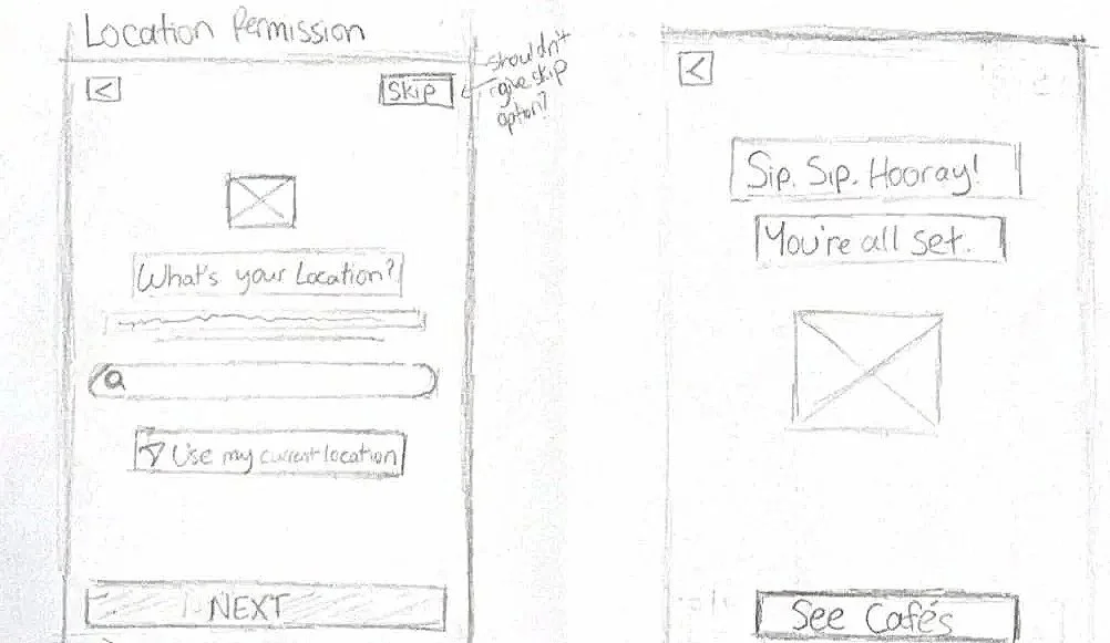
Wireflows
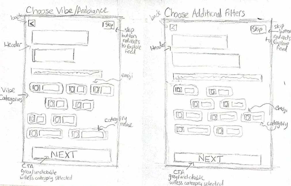
Paper Sketches
High-Fidelity Design
I build the visual foundation to bring the brand to life.
Design System
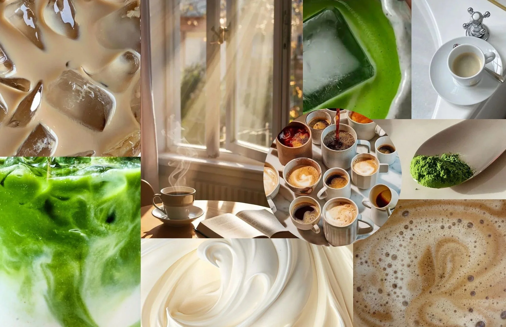
Reliable, warm, comfort, thoughtful, competent, slightly dreamy
The core personality shaped each visual decision to embody a trusted and inviting third place.
Mood Board
Sunlight and open window emphasizes the dreamy and comfort effect
Natural light creates an airy, welcoming mood that feels that feels naturally dreamy.
Soft browns, creamy beige, matcha greens set the palette and tone
Warm yet neutral palette that embodies matcha, coffee, and cafe culture.
Minimal and neutral colors act as the ideal backdrop
Serves as a clean backdrop that keeps the focus on featured cafes.
Low-Fidelity Mockups
Medium-Fidelity Mockups
This is a portion of the high-fidelity designs that formed the clickable prototype used for usability testing, setting the stage for validation and final refinements.
Usability Tests
While completing tasks in the prototype. I guided the users to narrate their thoughts to measure how well the app felt.
Think-Aloud Protocol
“It feels like I’m choosing between the map or the list view.”
QUOTE 2
“I wish I could see both views without one disappearing.”
Toggling between map and list views felt clunky, adding unnecessary friction.
SOLUTION:
Simplify home screen by defaulting to map view with a swipe-up list panel at the bottom.
QUOTE 1
PROBLEM:
Filter management during onboarding needed refinement
SOLUTION:
Added “Skip for now” button for better reassurance
QUOTE 3
“I need both the map and list views to decide where to go.”
Landing page
PROBLEM:
Profile cards had too much information right away, reducing scanability
SOLUTION:
Showed key details upfront and moved secondary info into tabs for better readability
PROBLEM:
High Fidelity Prototype
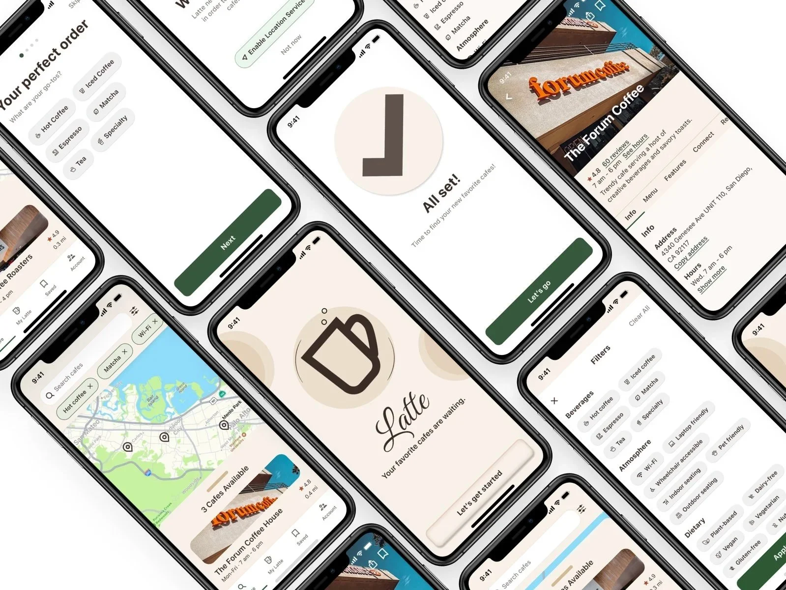
After gathering insights from low-fidelity testing, I created a high-fidelity prototype using Figma. It incorporated refined UI elements, improved navigation, and interactive flows based on user feedback.
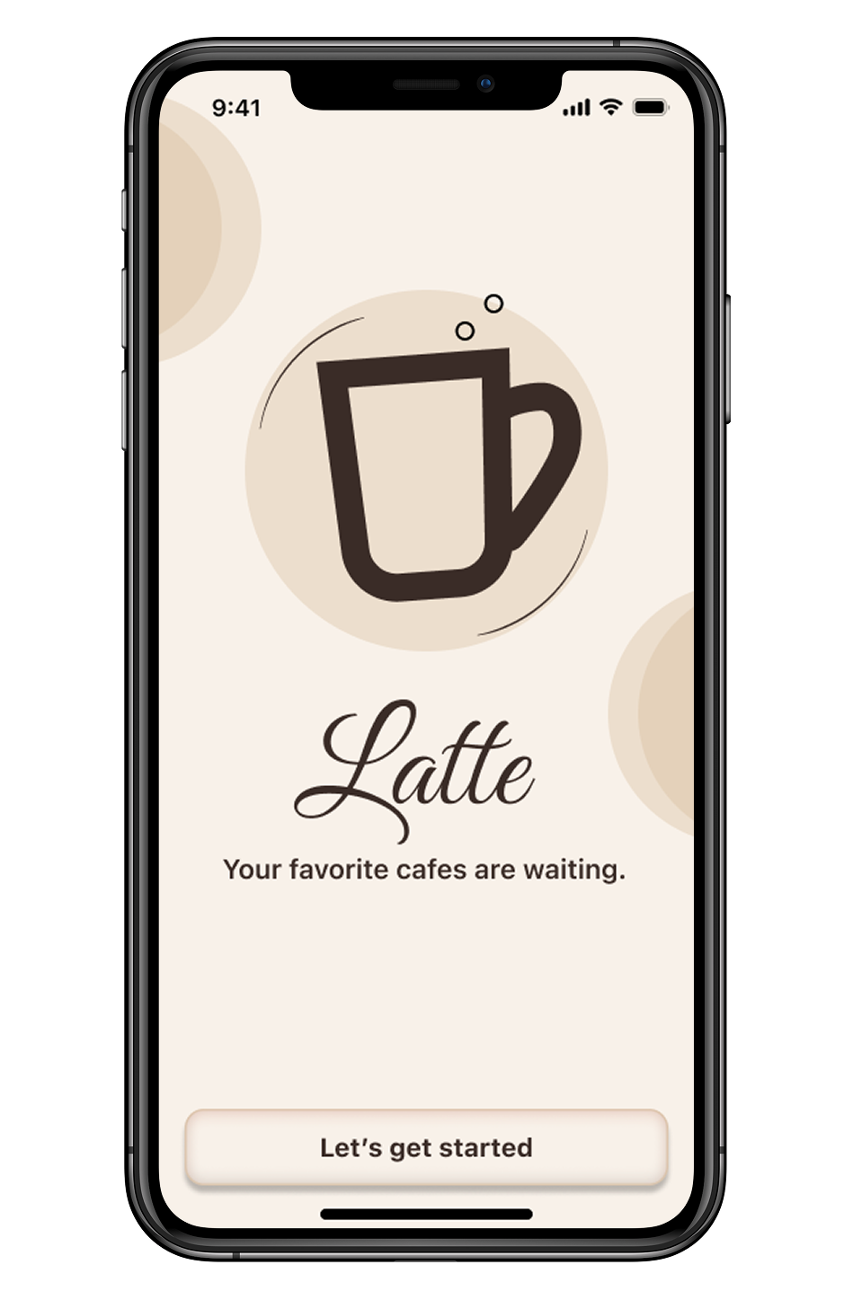
Welcome/Start page
Introducing…
Latte
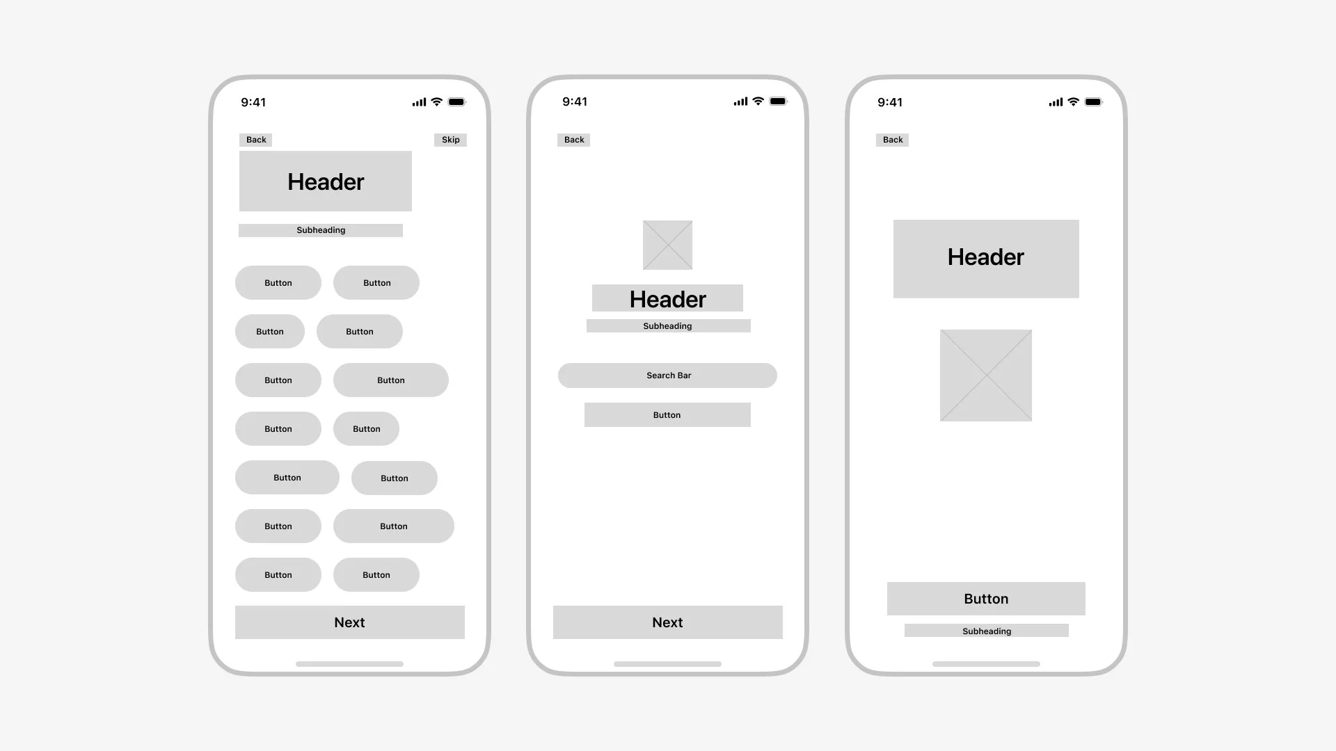
Beverage preferences: users select their usual drink orders establishing core tastes
Environmental preferences: helps match users to locations that fit their lifestyle and needs
Dietary preferences: Promotes inclusive discovery
Permission prompts: reworded for clarity and trust
Onboarding
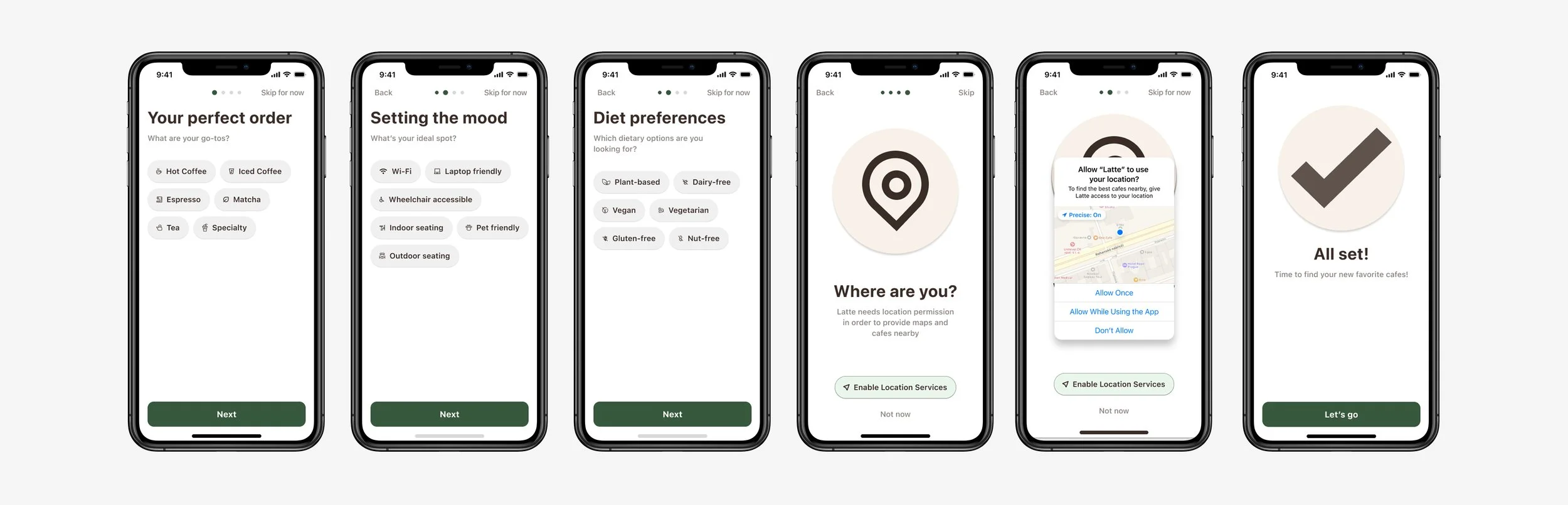
Optimized to deliver personalized guidance while respecting users’ time.
Both the map and list views are visible on the same screen.
List view is fixed in the bottom quarter as an overlay; no toggling needed.
Map & List View
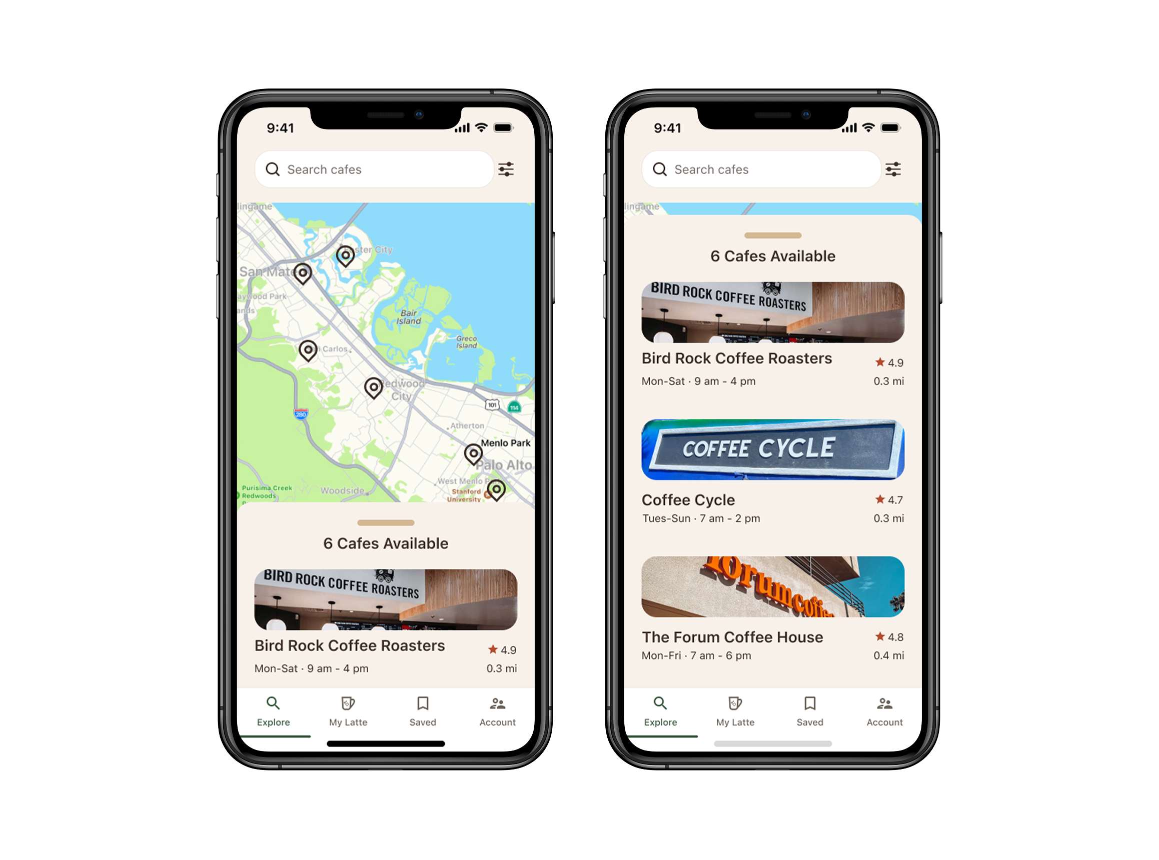
Users can filter personalized preferences falling in categories including beverages, atmosphere, dietary, and more.
Explore Page
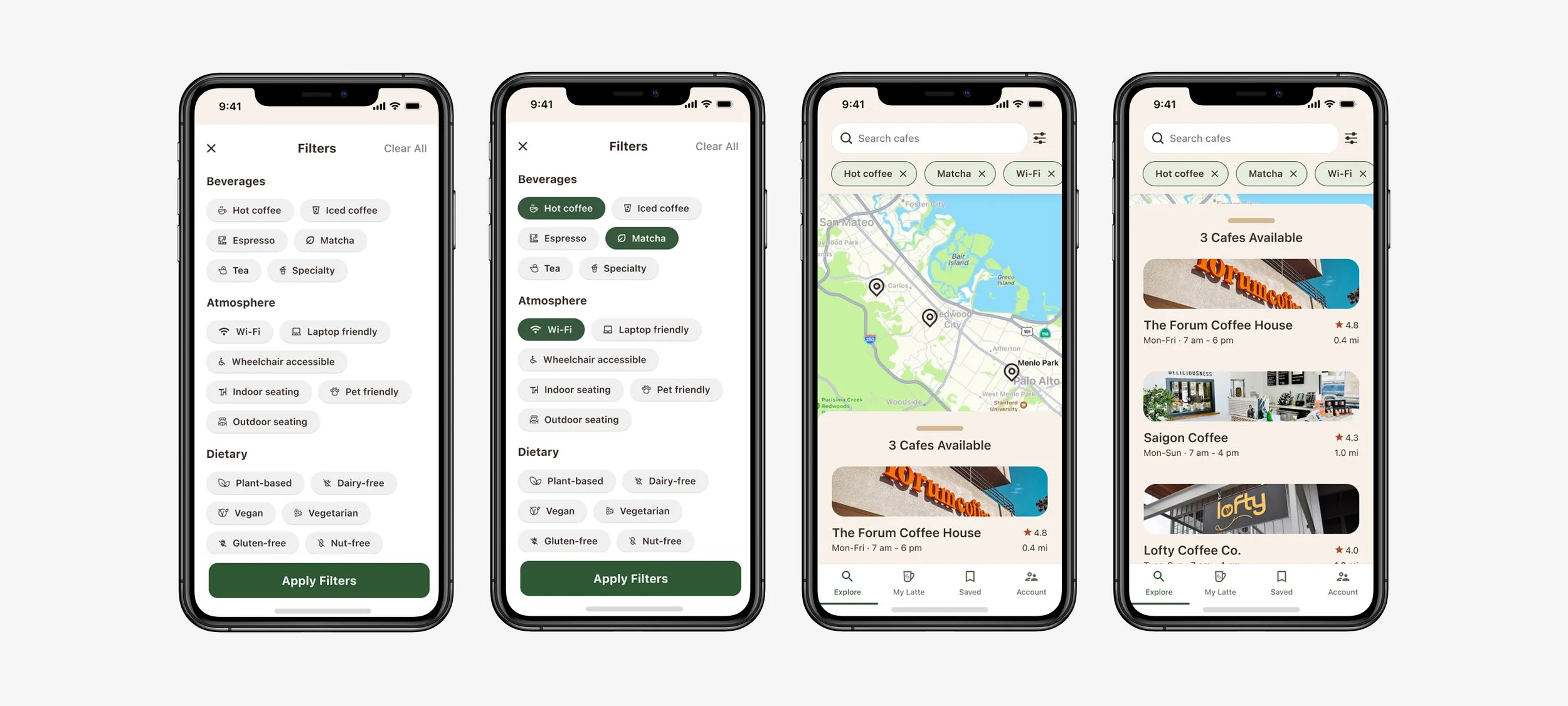
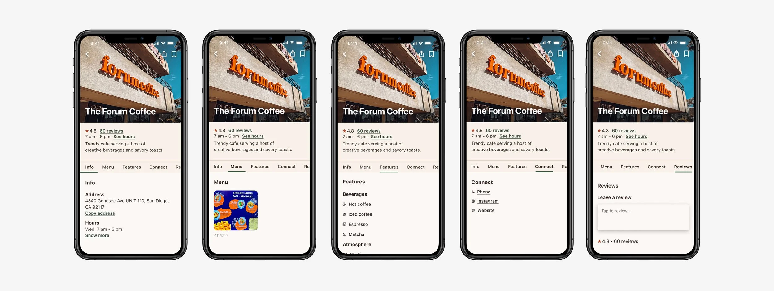
Tailored for swift scanning, each card includes the cafe’s address and hours, menu offerings, standout features, social media platforms, contact information, and reviews.
Cafe Profile Cards
Designing Latte taught me how to build for connection, not just usability. By gaining a deeper understanding of the users and the root of their needs, I uncovered the overlooked significance behind a seemingly routine act.
Final Reflection
This project sharpened how I create solutions for modern consumer needs, showing the value and impact of human-centered design.
